Tijuana River Valley Dashboard
An interactive dashboard empowering residents to track sewage pollution, water quality, and environmental hazards in real-time for better health and recreation decisions.
Problem
Sewage pollution in the Tijuana River has long impacted South San Diego communities, creating health risks and uncertainty around recreation. Residents lacked a simple way to access timely, trustworthy environmental data.
Solution
We designed a web-based dashboard to provide:
- Real-time water quality measurements and pollution alerts
- Contextual information on ongoing remediation efforts
- Easy-to-use filters and maps for residents to make informed decisions
Design Process
Research & Insights
Resident interviews, surveys, and environmental data analysis highlighted key requirements: mobile-friendly access, multilingual support, and simplified data visualizations.
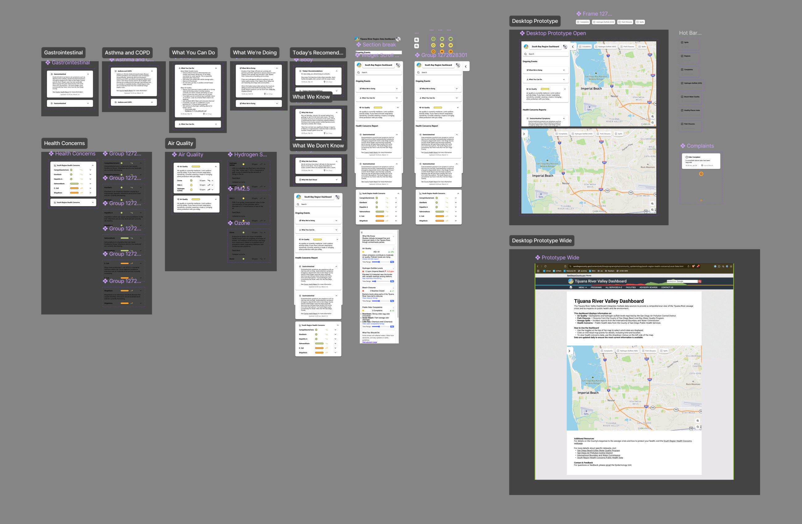
Wireframing & Prototyping
Wireframes established hierarchy and flow. Figma prototypes allowed stakeholders to interact with the dashboard, providing actionable feedback for iteration.
Visual Design
Clear iconography, color-coding, and accessibility standards (WCAG) ensure that users quickly understand data (e.g., red = high pollution).
Development Collaboration
Worked closely with developers to maintain fidelity, accessibility, and responsiveness across desktop and mobile platforms.
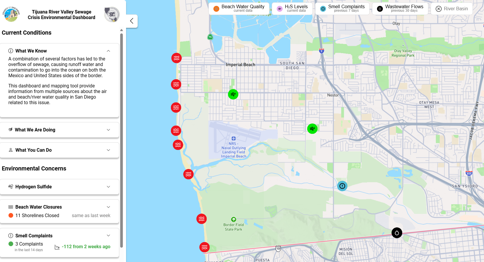
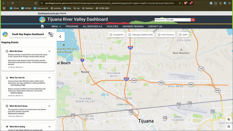
Key Features
- Interactive Map: Real-time updates for closures, H₂S levels, and spills
- Information Sections: “What We Know,” “What We’re Doing,” and “What You Can Do”
- Filters: View data by category or time frame
- Responsive Design: Works seamlessly on phones, tablets, and desktops
Impact
The dashboard has become a trusted resource, helping residents make informed decisions and raising awareness about environmental hazards. Policymakers also leverage the data for planning and community interventions.
View the live dashboard: https://southregion.resilienthub.org/